|
Nox Engine
|

|
|
Nox Engine
|
|
A UI component that can be clicked to trigger a callback function. More...
#include <Button.h>
Public Member Functions | |
| Button (std::string inStr, int x, int y, int w, int h, float scale, SDL_Colour defColour, SDL_Colour hoverColour, SDL_Colour textColour, std::function< void()> func) | |
| Constructs a fully customized Button. | |
| Button (std::string inStr, int x, int y, int w, int h, float scale, std::function< void()> func) | |
| Constructs a Button with default colors. | |
| Button (std::string inStr, int x, int y, int w, int h, std::function< void()> func) | |
| Constructs a Button with default colors and scale. | |
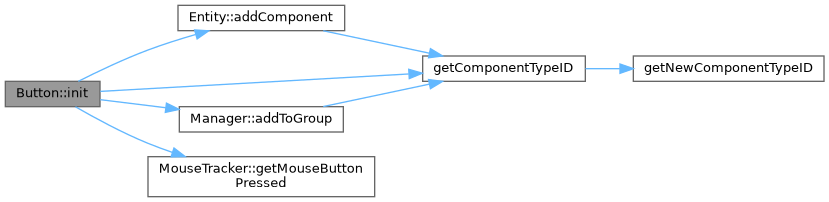
| void | init () override |
| Initializes the button's components (transform, collider, text). | |
| void | update () override |
| Checks for mouse hover and click events to update the button's state. | |
| void | reload () override |
| Reloads the button's texture, useful after state changes. | |
| void | draw () override |
| Draws the button's background and text. | |
Additional Inherited Members | |
 Public Attributes inherited from Component Public Attributes inherited from Component | |
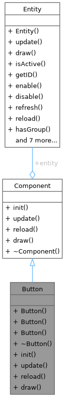
| Entity * | entity |
| Pointer to the entity that owns this component. | |
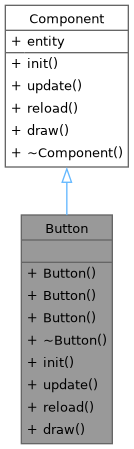
A UI component that can be clicked to trigger a callback function.
Combines a collider, text, and transform to create an interactive button. It changes color on hover and executes a function when pressed.
| Button::Button | ( | std::string | inStr, |
| int | x, | ||
| int | y, | ||
| int | w, | ||
| int | h, | ||
| float | scale, | ||
| SDL_Colour | defColour, | ||
| SDL_Colour | hoverColour, | ||
| SDL_Colour | textColour, | ||
| std::function< void()> | func | ||
| ) |
Constructs a fully customized Button.
| inStr | The text to display on the button. |
| x | The x-position of the button. |
| y | The y-position of the button. |
| w | The width of the button. |
| h | The height of the button. |
| scale | The rendering scale of the button text. |
| defColour | The default background color. |
| hoverColour | The background color when the mouse hovers over it. |
| textColour | The color of the button's text. |
| func | The callback function to execute when the button is pressed. |

| Button::Button | ( | std::string | inStr, |
| int | x, | ||
| int | y, | ||
| int | w, | ||
| int | h, | ||
| float | scale, | ||
| std::function< void()> | func | ||
| ) |
Constructs a Button with default colors.
| inStr | The text to display on the button. |
| x | The x-position of the button. |
| y | The y-position of the button. |
| w | The width of the button. |
| h | The height of the button. |
| scale | The rendering scale of the button text. |
| func | The callback function to execute when the button is pressed. |

Constructs a Button with default colors and scale.
| inStr | The text to display on the button. |
| x | The x-position of the button. |
| y | The y-position of the button. |
| w | The width of the button. |
| h | The height of the button. |
| func | The callback function to execute when the button is pressed. |

|
overridevirtual |
Draws the button's background and text.
Reimplemented from Component.

|
overridevirtual |
Initializes the button's components (transform, collider, text).
Reimplemented from Component.
|
overridevirtual |
Reloads the button's texture, useful after state changes.
Reimplemented from Component.
|
overridevirtual |
Checks for mouse hover and click events to update the button's state.
Reimplemented from Component.

 1.9.8
1.9.8